Aspiring data scientist with a human centered approach
Microsoft Stream Analytics
The goal of this project was to build a database for Microsoft Stream that would track who customers are and how they use the product. This database would ultimately be used by Microsoft to perform customer analytics for their video platform, Stream. My team built a database, populated it with mock data, and performed analytics using the database. We then presented the findings of our analysis to our project manager to show the power of using our schema.

Research Problem and Setup
Microsoft risks losing millions of users and hundreds of millions of dollars if it does not properly understand it's user needs. Our team set out to understand exactly who is using Microsoft Stream, why they are using it, and how they are using it. By understanding things like who our users are, why they use Stream, when and where they use it, and how they use it, we can get key findings that can be used to make actionable decisions to make Stream a better product to increase engagement and revenue.

Building the Database
Based on Microsoft's needs, we needed to build a database that could efficiently store data on customers, where they are from, who they work for, how long they use Stream for, what they use Stream for, and much more. We began by making a rough model of our relational database in LucidChart and then using SQL to code and populate the database with mock data.

Organizing Data for Analytics
Once we built the database, we moved into the analytics side of the project. My main role for this part was to write the queries to create the views and computed columns in our database that would ultimately be directly used for the visualizations we created.
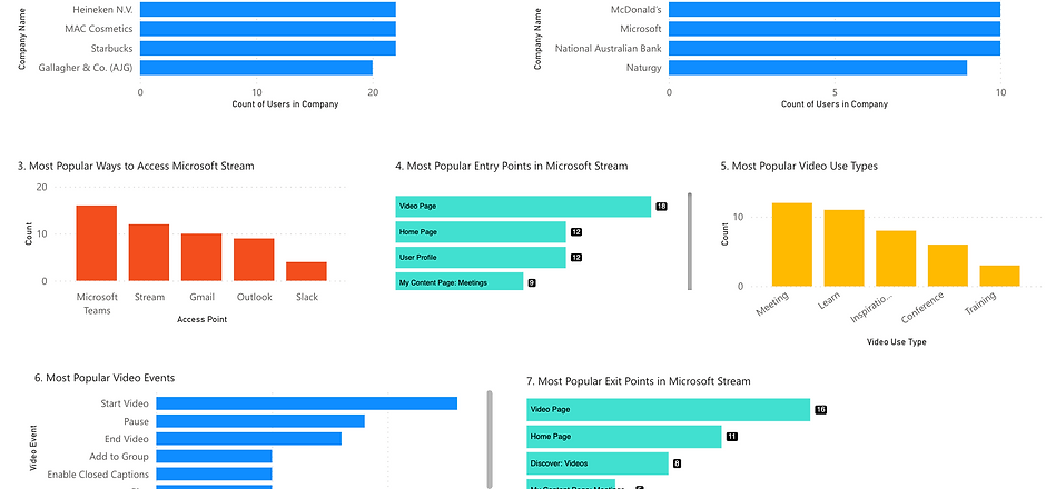
Stream Analytics
Using Power BI, we created some simple yet effective visualizations to show information that we thought would be useful for executives to make decisions about Microsoft Stream. These visualizations show how users are accessing Stream, the most popular video types, where people leave stream, and more. This data can be used to know what features need to be expanded, or even which features need to be improved for better customer retention. View the interactive dashboard below.

Executive Summary and Presentation
Upon completing our dashboard, we created a final presentation and presented it to our mentor at Microsoft, a Senior Data Engineer for Stream. This presentation explained why our work was important and defined metrics that we measured in our database that were shown in the visualizations. The link below brings you to the google slides version of the presentation with notes explaining more on our thought process.